Introduction
The third week’s assignment consisted of building wireframes for a journey planner app. A list of requirements following the MoSCoW method was provided. The most important considerations are that the planner should provide the user different route options and that it should also provide routes for general public transportation, walking, and cycling.
We had the option of building the app either for mobile or for desktop platforms. I chose to do it for mobile because of the “mobile first” philosophy.
The entire process accounted for building initial wireframes, testing them and make improvements based on feedback from other colleagues. Results can be seen below.
Wireframes
I started with hand sketching how the app could look like.
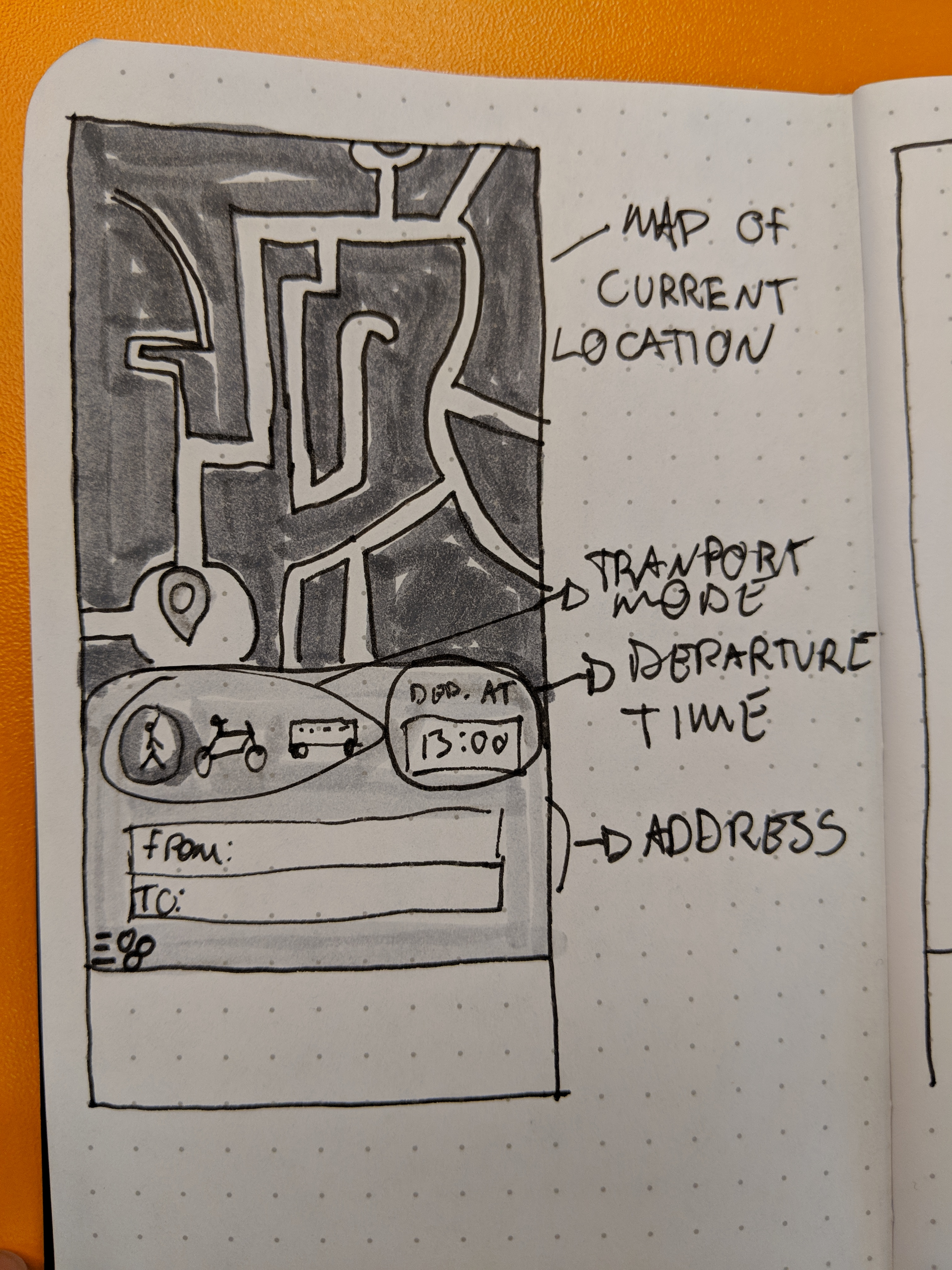
Even though the hand drawn sketch was simple it already helped me realize some thing I should and shouldn’t do on the final version:
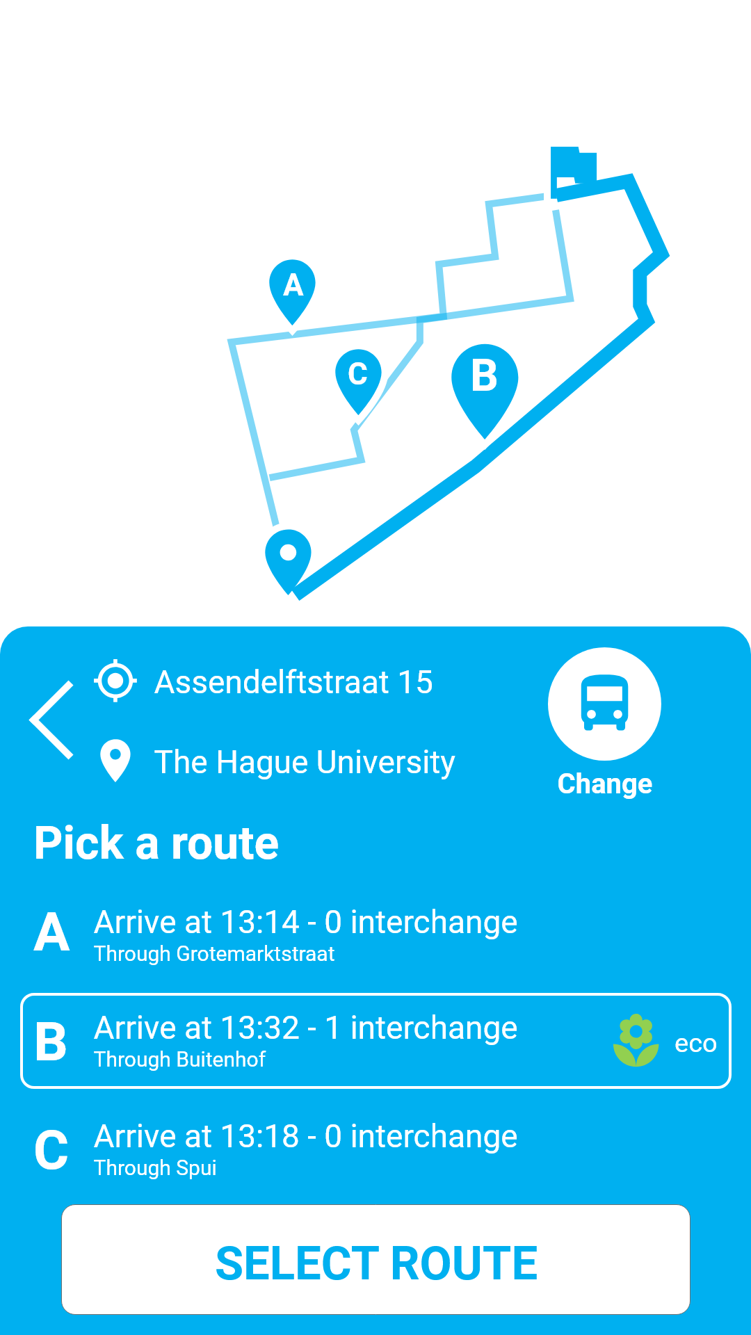
- Displaying different routes for all methods of transportation would clutter the screen. I decided to display three different routes for the selected method, with the option of changing the transportation even after the results are shown;
- Considering the “thumb-zone”, I chose to display the map on top, while all the buttons, text fields and other interactive elements are on the bottom.
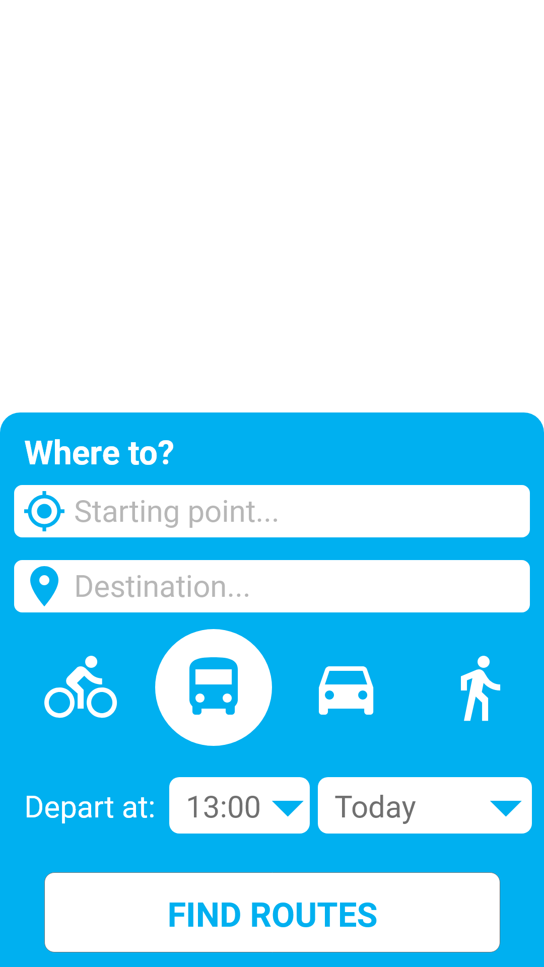
From the had drawn sketches, I did the initial digital wireframes:


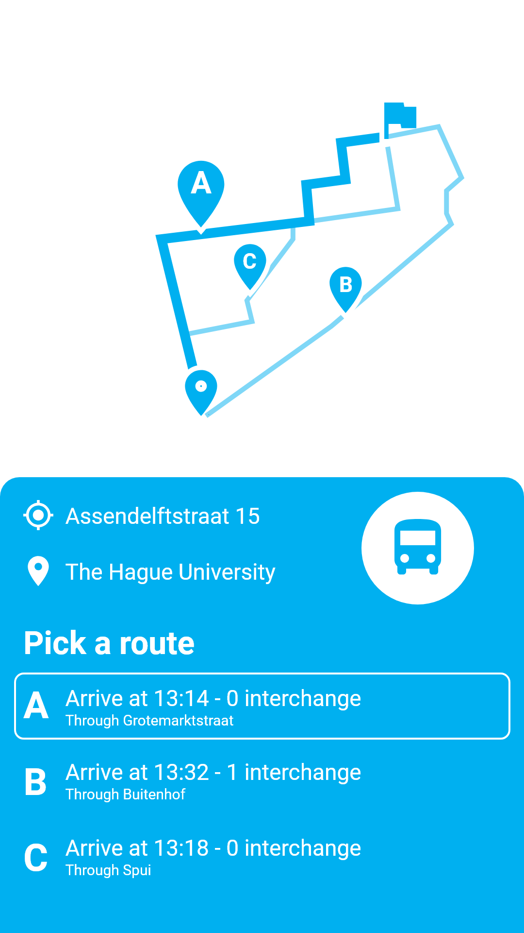
After doing the digital wireframes, some other things became clear after testing:
- Initially I was going to divide the interface in a two-step process. First the user would select the addresses, then proceed to where options like departure time and method of transportation would be displayed, and only then the results for the routes would be displayed. This proved to be too long of a process and considering that journey planning apps are usually used in rushed settings the final wireframe has one screen for the options;
- Using two colors (white and blue) is good, but highlighted elements could have a third color. I chose for the tripp3r green as a highlight color to keep up with brand identity and to be color-blind accessible.
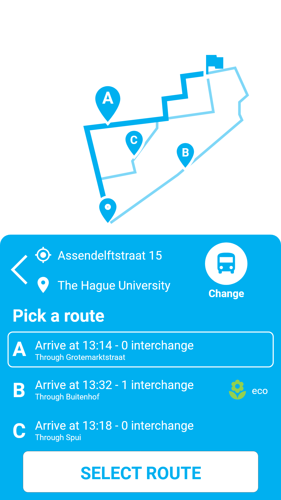
The final wireframes can be seen below. Note the different menu navigation and the back button.
Testing
The tests were conducted by asking colleagues to use the app with a simple instruction: “navigate through the app and choose the quickest route to your destination”.
The clickable wireframe was uploaded to a smartphone using the Adobe Xd app. I didn’t record the tests in any way except for writing down feedback given by my peers. Out of the four people tested, these were the most common usability problems:
- The two-step process is too long (3 people);
- Text-field too small. (4 people)
- Can’t return to address selection screen (only one person, but it’s a critical error)
- Selecting addresses on the map is not possible (4 people. I overlooked this requirement.
After the feedback I adjusted the wireframes and no other test was performed.
Reflection
It was interesting to do wireframes. With the little experience in interface design that I have, I always thought that wireframes were somewhat too simple to get any valuable feedback. I was proven wrong after asking my colleagues to use my wireframe.
The depth of the insights they provided was sufficient to significantly improve my interface, and although the same could probably be achieved with the high-fidelity prototype, this was probably less time consuming and quicker to adjust functionalities based on feedback.
I must still learn how to balance the complexity of my wireframes, though. I have a constant battle between thinking I am not being detailed enough and thinking I am making things too complex. I feel I will learn how to balance this with time.
END OF ENTRY