Introduction
This week’s assignment was to design an interactive high-fidelity version of the wireframes done in week 3. This should be a final version on the app’s visuals. After the prototype was done a colleague did an expert review on it.
Prototype
My final prototype followed the interface of the wireframing, with the main navigation being at “thumbs reach”. This time I used an actual map other than just leaving it blank, and also added more realism to other elements. The results are shown below:
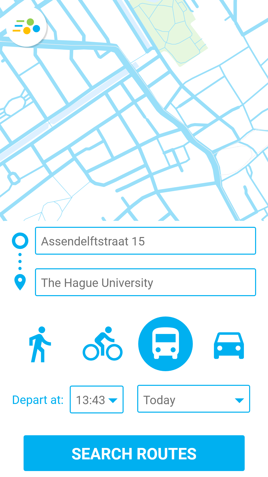
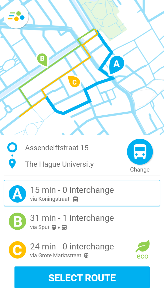
Following feedback from my peers on last week’s assignment I changes the background from blue to white to improve readability. I also added the Tripp3r colors to the route options to make it more characteristic of the brand.
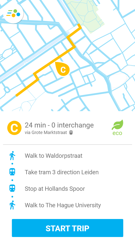
Also, I used as example a trip using public transportation. For the sake of not cluttering the interface, the “bus” icon is used to select public transportation as a method. When the routes are displayed, icons for different types of public transportation (metro, tram…) are shown to clarify the user on what to do.
Expert Review
I asked Alex to do an expert review on my current interface, and this is what he noted:
Simple and natural dialogue:
- Going back to address input screen is not possible.
- Solution: Add a back button or gesture.
Make things efficient
- Maybe having to select the route and then press the button takes too long.
- Solution: Make the user select the route right away when he presses it.
Provide feedback
- What does ECO mean? No question mark is available, and the concept can be pretty broad.
- Solution: Make a little popup whenever the user taps the eco button.
Be consistent and use standards
- The icon colors are only different from the route selection part on.
- Solution: Implement the different colors throughout the entire app, or don’t use them at all.
Use visual hierarchy and keep it simple
- The blue route is hard to distinguish from the map colors.
- Solution: Change either the map or the route color.
- There’s no clear divisor between the options tray to the map. Minimalistic, but visually complicated.
- Solution: Improve color contrast.
Use emotion
- The interface doesn’t really communicate with the brands core values.
- Solution: Maybe make the UI friendlier looking and implement the brand colors.
Review Reflection
My colleague’s expert review was surprisingly helpful. I, again, overlooked the back button, and gained some insights on aspects of the interface I wouldn’t have found by myself.
From my perspective, knowing why I put everything the way it is, I understand why an explanation to eco needs to be available. It could mean a lot of things from being zero emissions to using a bus that has an environmentally friendly engine.
I also agree that I chose unorthodox colors. Maybe because of my color-blindness I see enough contrast, especially on route A’s blue shade against the map’s blue shade. I have figure out a way of displaying it all in a better way, probably by changing the maps color to a more traditional one.
Process & Tool Reflection
I continued working on Adobe Xd since it’s a familiar tool. I worked on the wireframes done last week, and it was a smooth process. This time I applied some more changes based on feedback I had received already. The result is a visually
similar
interface, with more polished items and an image of an actual map. To try an interactive version of the prototype, go to: BEP
Assignment 2.2
You can also view the prototype below. Please note that both here and on the link above the stroke widths are out of proportion because of Adobe Xd export settings.
END OF ENTRY