Introduction
This assignment consisted of building a paper prototype for a fitness tracker application for a smartphone and a smartwatch. The application should at least be able to:
- start and stop tracking in response to user’s input;
- track the burned calories, traveled distance, and current speed;
- display this information in real time to the user;
- display tracked data per day / week / month.
After the initial prototype was made, it was evaluated by fellow colleagues and adjusted according to feedback.
Prototypes
I decided to create my prototypes around cutout pieces of paper that resemble the devices’ actual height and width, so it is easier to size buttons and information around the screen.
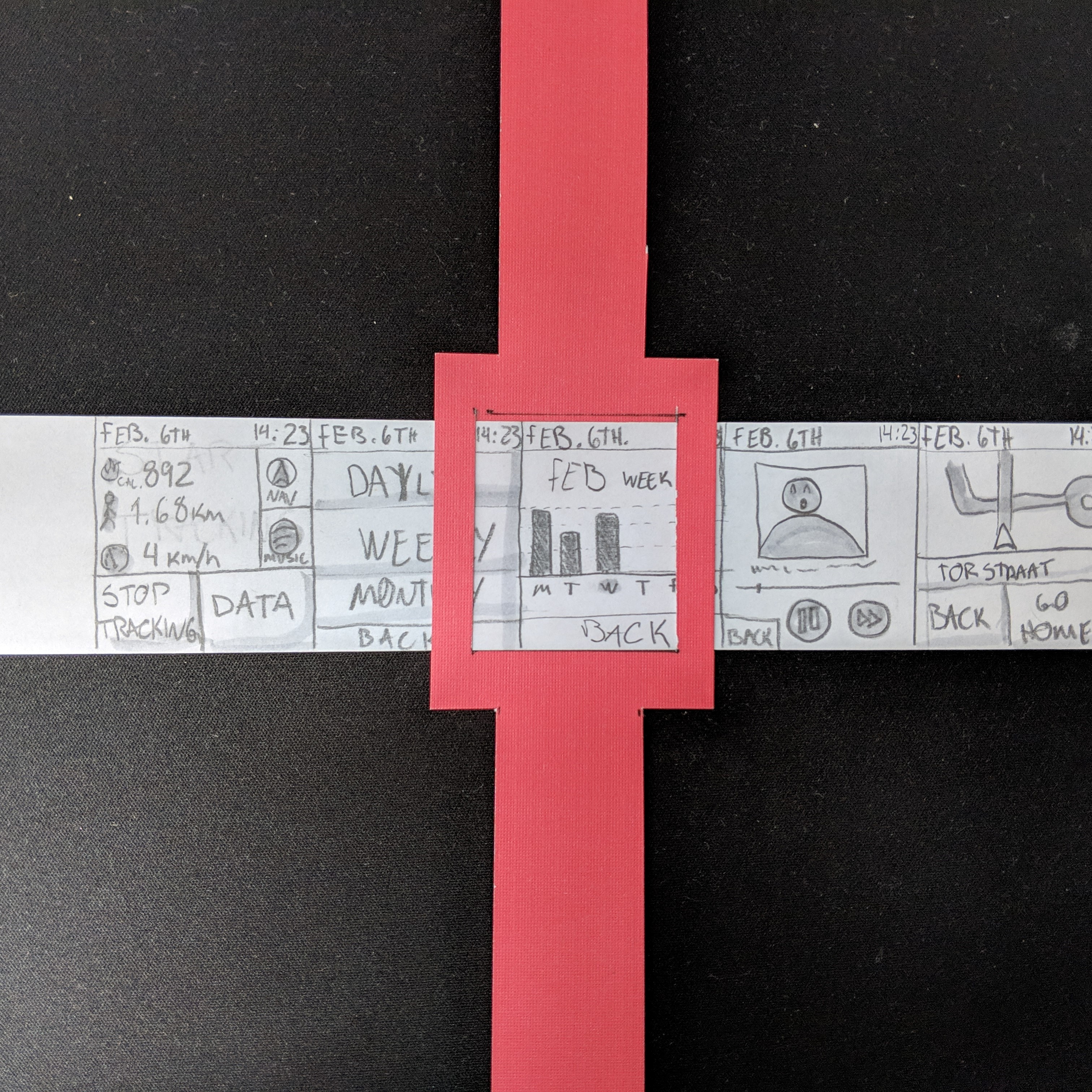
On both prototypes the screens are displayed by sliding a piece of paper left or right.
Initial prototypes
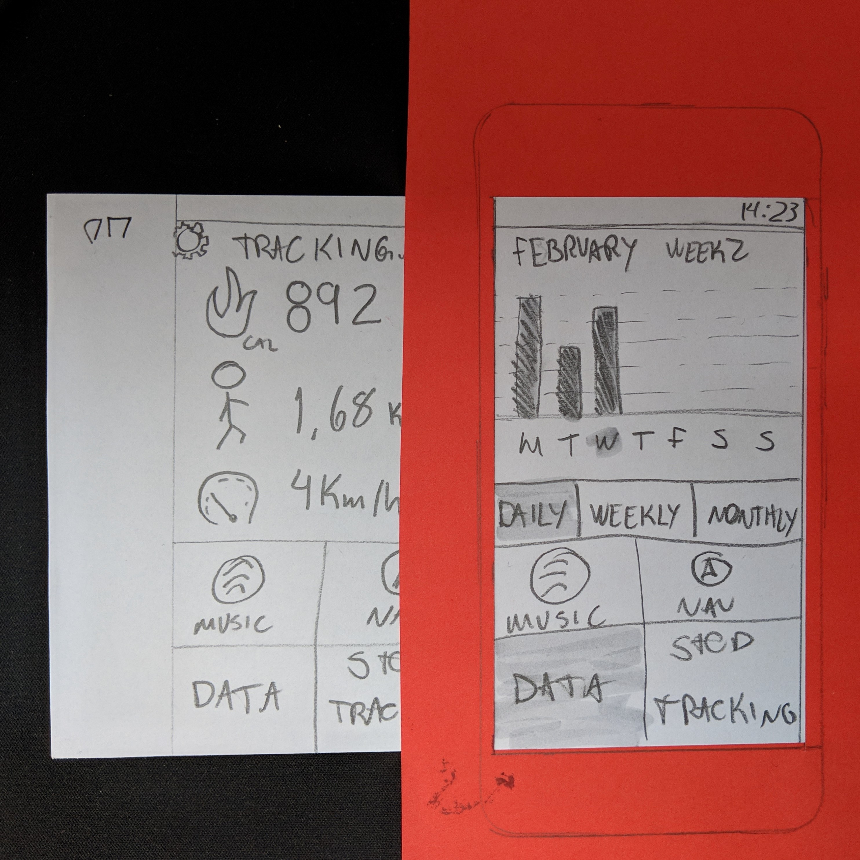
The first prototypes were made for the wearable device, following a progressive enhancement approach. Its main screen displays the current date and time, the user’s burnt calories, the daily distance walked and
the current speed. Also, on the main screen the user has access to other functionalities by tapping 4 buttons.
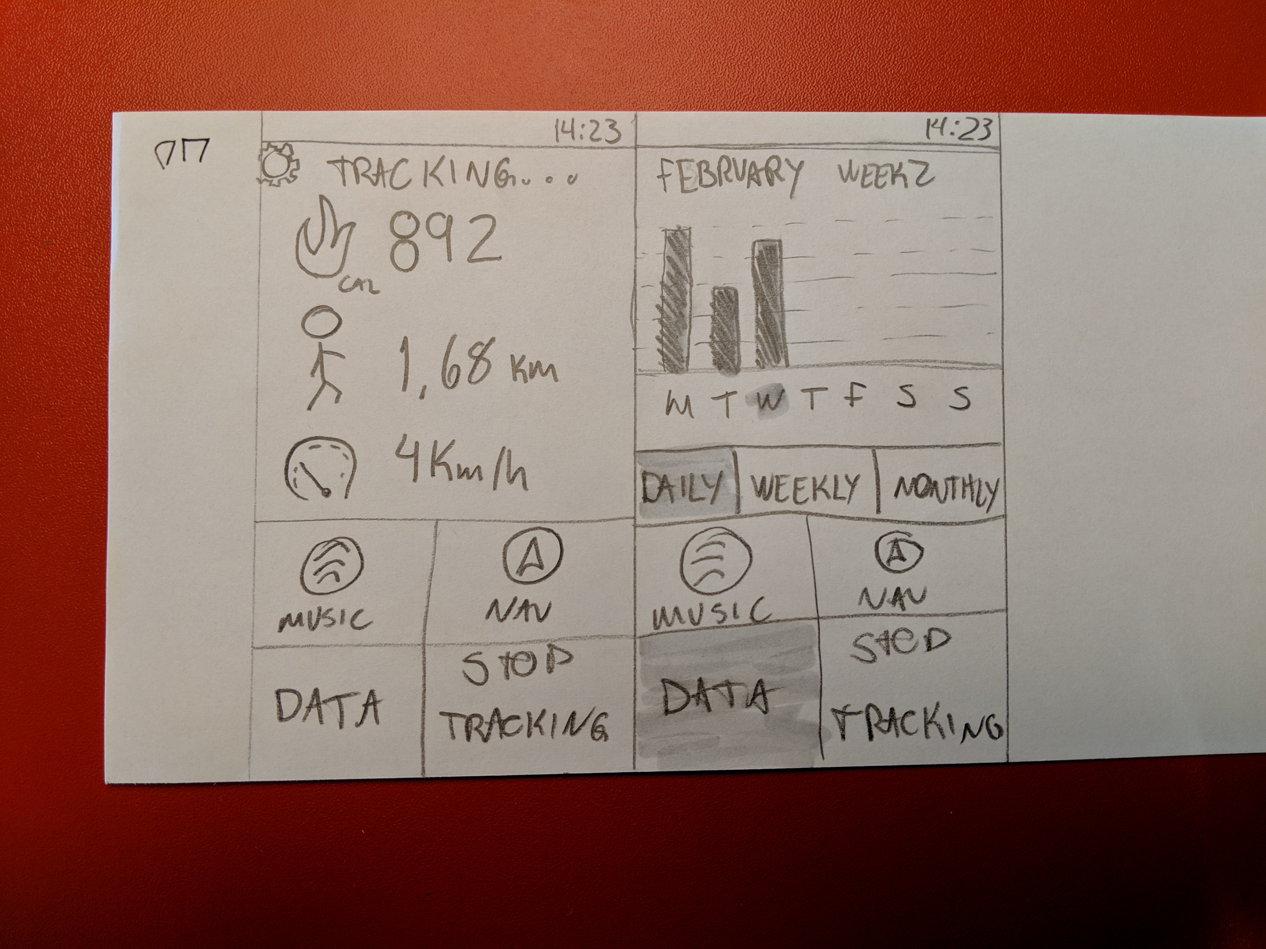
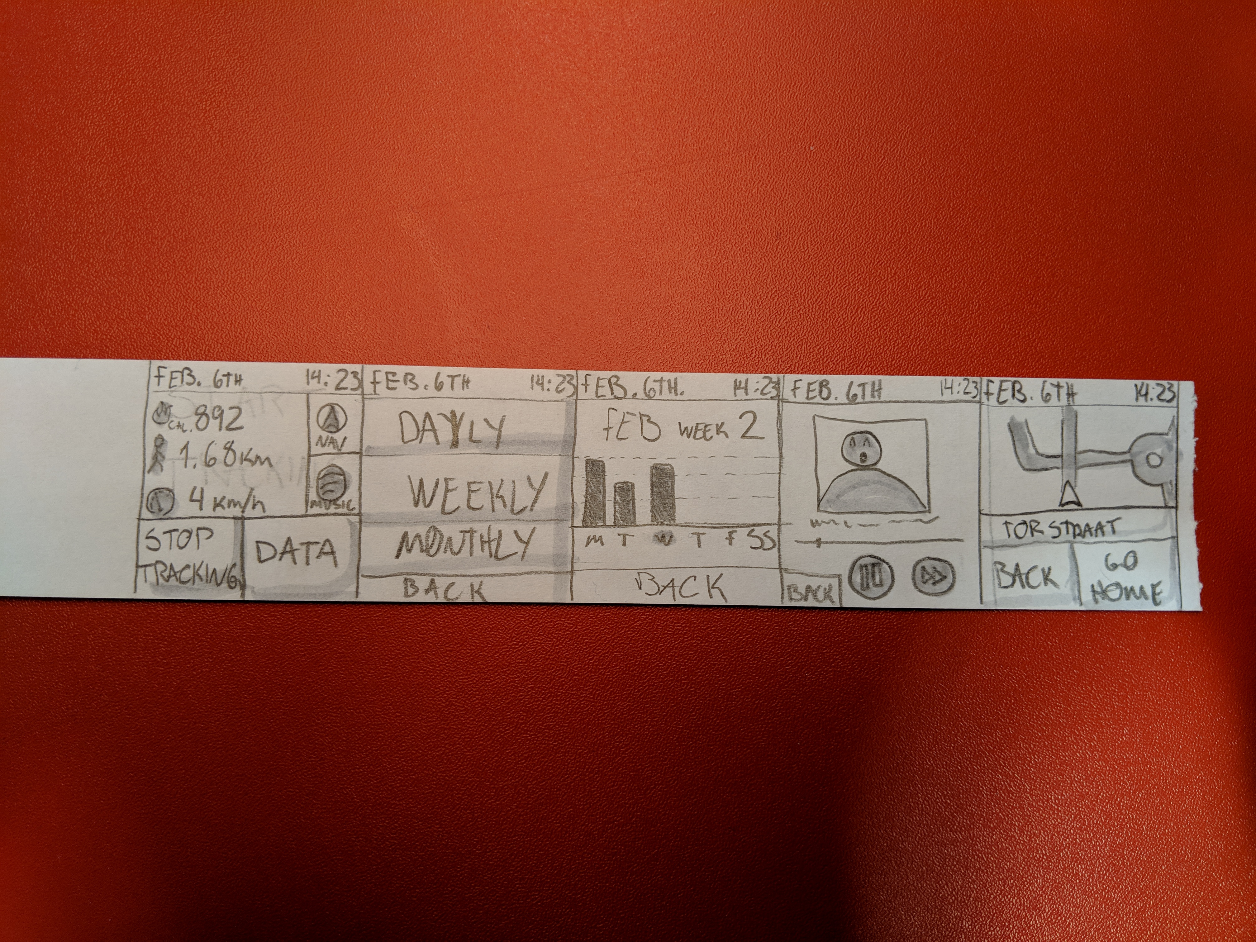
Tapping on the NAV button will take the user to a map, not only displaying its position but also giving the opportunity to guide the user to a certain location.
Tapping on the MUSIC button takes the user to the player screen. An image with the current song’s cover is displayed, as well as buttons to pause, skip and back.
Tapping on the DATA button, the user is asked to select a time span: daily, weekly or monthly. Selecting one of these will take the user to a screen where data is displayed in form of graphs.
Lastly, the user can tap on the STOP TRACKING button to stop tracking its activity.
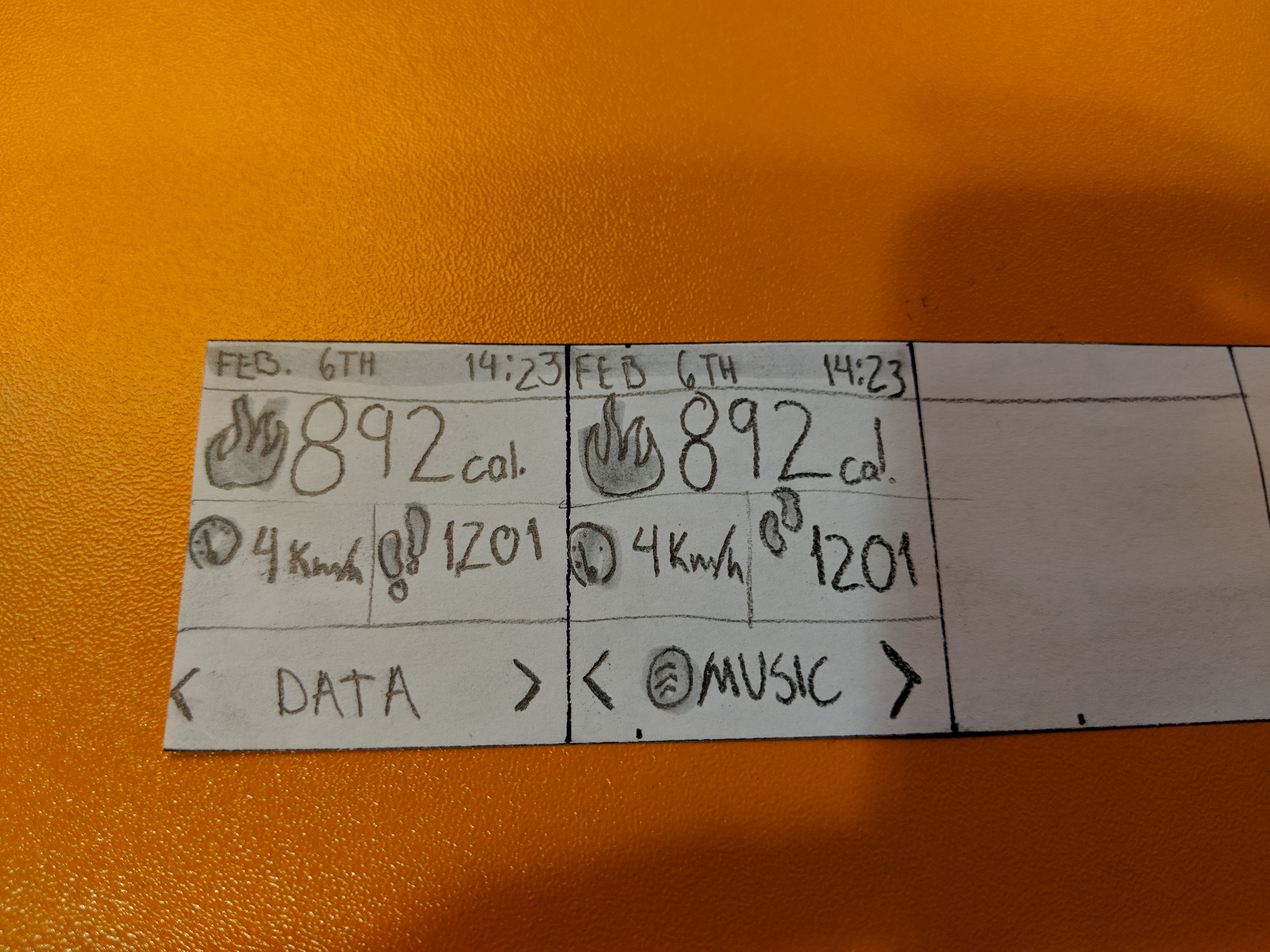
Post feedback prototypes
After the feedback sessions I redesigned the interfaces following what my peers told me that could be changed. Now the watch screen has better information display and the different buttons can be accessed by swiping left or right, like a web
carousel:
Evaluation
The prototypes were tested by asking a classmate to perform the following tasks:
- See your weekly report;
- Access the navigation menu;
- Stop tracking;
These tasks gave me insights on both features that I could be missing and also tips on how to make the UI better.
Findings
Some feedback given by my peers included:
Mobile version
- The menu is taking too much space;
- Information displayed could take more space and be better spaced.
Watch version
- Nav and Music buttons are way too small;
- Buttons in general area a bit small;
- Is the “stop tracking” needed on the home screen?
Reflection
Prototyping for a small screen such as the watch was very challenging, but it showed me how important it is to consider different screen sizes when doing UI design.
I was already familiarized with the “progressive enhancement” approach, but that usually applies from mobile to desktop. This activity showed me a different side to this approach that I haven’t had the chance of exploring.
END OF ENTRY